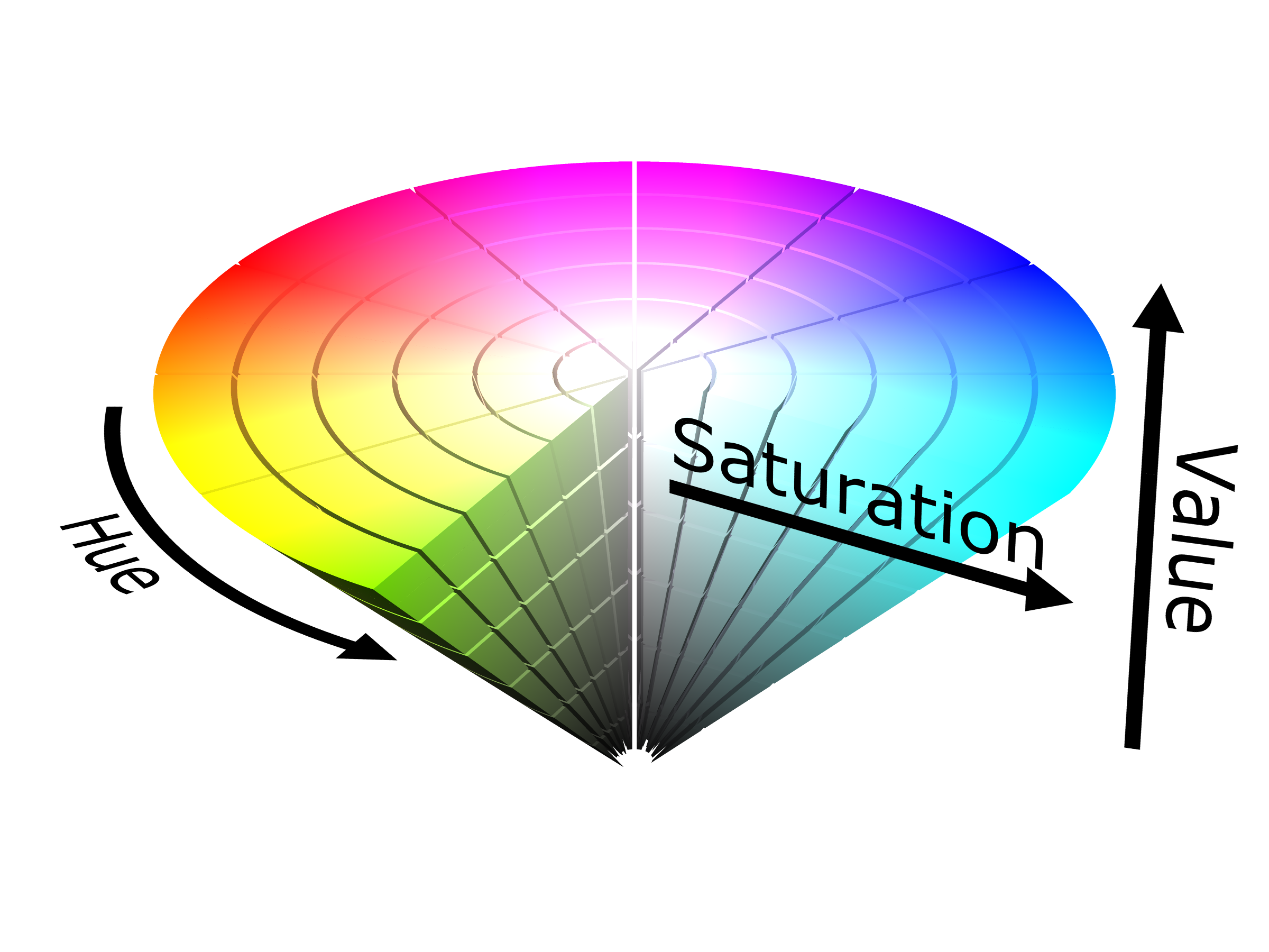
@Sebastien you've got a part of the answer! To ensure a good part detection, you need to have a good contrast between the background and the part during the object teaching. In order to have a good color contrast for the Wrist Camera, you need to use two colors that are as far apart horizontally as possible on the HSV cone shown below. Thus, black and white are not colors with a good contrast, since it is basically the same color with a different value. A great example of a good contrast would be blue and yellow, both saturated. 
I remember learning this in the training.
Object Teaching
For reflective objects, you can spray matte paint on it for the object teaching. For reflective objects or objects with too many features, you can print a drawing of the object, with the correct size, with only the features you wish to teach. You can also select only the area of the part you want to teach.
For reflective objects, you can spray matte paint on it for the object teaching. For reflective objects or objects with too many features, you can print a drawing of the object, with the correct size, with only the features you wish to teach. You can also select only the area of the part you want to teach.
Source: http://support.robotiq.com/display/RVS/5.1+Guidelines+on+Object+Teaching
So, for your steel part, it may be easiest to print out the CAD or to cover it in matte paint. I was also thinking blue painter's tape over the surface with a yellow background may allow you to get that key contrast.
Hope this helps!

 Annick_Mottard
 matthewd92
Every time I am trying to teach a part with the camera, I am always asking myself what is the best background I can use to teach. I understand that we need good contrast with the part. So my first guess is to look at the subtractive primary colors and make sure that the color of the part and the color of the background are not shared region in the circles making this pallet. So for example I used a cyan background for yellow parts. Or avoid using green on yellow for example.
Thanks to Wikipedia for explaining colors to me again! The time I did some art at school is a bit far behind me!
Any tips you pros have?
Is black and white combination the best?